


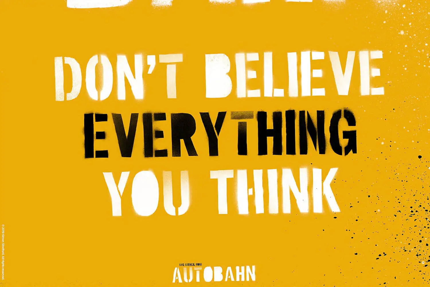
If you ask me what the best stencil font is for realistic spray-paint detail, I’m going to say Autobahn. Obviously. I made it. But there’s a reason beyond wanting you to buy one of my fonts: the paint.
Autobahn has so much detail: the spray paint, the overspray, the drips and the uneven edges that make sprayed lettering look like the real thing. It looks like the real thing because it is the real thing.
It’s not AI-generated. It’s not fake spray paint made in Photoshop or Illustrator. It’s real paint on real paper.

There are plenty of clean stencil fonts. In fact, there are hundreds of them. But in my opinion, nothing touches the detail Autobahn has. And to be honest, if you want a clean font, that’s fine. Go ahead. But if you want something more realistic, read on.
I wanted to keep the grime, the dirt, the mess that happens when you spray paint through a stencil. Not a cleaned-up version, but the actual spray-paint marks.
The important bit isn’t the hand-cut stencil
I cut all the stencils out of paper by hand. Fiddly work, but that gave me the letter shapes. The interesting bit came afterwards, when I got the spray paint out and started hitting the stencils with it. Blimey. Spray paint does make a hell of a mess.
The important part is that I sprayed them with real spray paint.
That includes all the happy accidents: drips, overspray, underspray, little splatters and patches where the paint didn’t quite cover the surface.
Some areas are dense and dark. Others are lighter. Some edges behave themselves. Others don’t.

It’s all part of the process. And that’s the bit I love: making things, trying things, getting paint everywhere. The cleaning up, less so.
I wanted to keep the accidents
When you turn something handmade into a font, there’s a temptation to clean it up. Straighten that edge. Remove that mark. Make everything a bit more consistent.
But with Autobahn, cleaning away the paint would have removed the reason I made it.
The uneven coverage and faint marks around the edges aren’t bits I forgot to fix. I left them in because that’s what the paint did. Tidying them away would rather defeat the point.
Obviously, I wanted it to look sprayed. Not like an AI-generated, tidy idea of spray paint, but real spray paint. That’s the difference.
Why OpenType SVG matters
An ordinary outline font uses points and curves to define shapes that your software fills with colour. It's all points and maths. When I tried to keep all those tiny spray marks in Autobahn’s vector version, I ran into export problems. The computer says no.

So I had to take my spray paint work and condense it down, reduce the points, reduce the detail until I could get the vector version to export. And that took something away from the design.
But with an open type SVG bitmap font, you can put intricate detail into the design, and it keeps every subtle change and transparency.
The darker paint, lighter patches and partly transparent spray can remain together inside the letter. I don’t have to turn every faint mark into a solid black shape—or remove it altogether.
The technology doesn’t create the character. The spray paint does that. The technology helps me keep it.
If you want to know more about how this works, I’ve written a separate post explaining what OpenType SVG fonts are and how bitmap and vector versions differ.
Autobahn: vector versus bitmap
Put Autobahn’s own vector and SVG bitmap versions side by side and the distinction becomes much easier to see.
The vector version keeps the letter shapes, stencil gaps and rough outlines. It isn’t a completely clean stencil font, but the paint appears as solid shapes.
The SVG bitmap version gives you the subtle painted surface as well.

The example above shows Autobahn vector versus Autobahn bitmap. And although the vector version looks cleaner, don't get me wrong, it's still amazingly grungy. I spent a long time creating the vector version, reducing the points until I could get it to export properly.

But you can clearly tell the difference between the two. You might prefer the vector. You might not.
But the bitmap version, it retains the spray marks. The vector version has an approximation of it.
A lot of the fine spray detail is just lost. I couldn’t keep all that fine spray detail in the vector version. It's just too many vector points.
Don’t get me wrong. A clean stencil font isn’t badly made. It has its job, and a clean font might be just what you’re looking for. But Autobahn is doing a slightly different job. It’s making a stencil font that is truly authentic and not cleaned up.
The clean geometry doesn’t really interest me. What interests me is the detail: the paint, the uneven edges, the marks, the dirt, the grime. That’s what I find interesting.
The best of both worlds
So the great thing with Autobahn is you get the best of both worlds. You've got the vector version, if you want to scale it up to huge billboard sizes, and you've got the bitmap version, which retains all the lovely details. But because it's a bitmap, if you scale it too much, it's going to start to pixelate.
So having both versions of the font is a bonus, because it took me bloody ages to create the vector version, reducing the points, reducing the points, saving, errors, etc. It was a nightmare, but we got there.
And now you get to enjoy it, both versions. Lovely.
The paint belongs to each letter
Autobahn isn’t a clean alphabet with one distressed texture laid across the whole word.
The marks came from the sprayed letters themselves. That gives the individual characters their own patterns of paint and damage.

The font also includes alternative uppercase forms in the lowercase a–z positions, so you have another version available when a letter repeats.
The alternatives give you extra choice because each one has a different texture, different paint. The alternative gives you that variation that you might need in your design to stop it looking repetitive.

You generally get three alternatives for each character. And the bit I really like is if it contains counters, I've removed the counters so you get a solid shape of black spray paint. And it looks really neat when you're designing. It looks really cool.
Quite often when you’re using paper stencils, the little bridges holding the counters in place tear, and the centres fall out. So I pushed that further, removed them deliberately and hit the whole thing with spray paint.
And yes, there are more drips
Autobahn also comes with 42 separate high-resolution spray-paint drips.
These are additional assets, separate from the lettering. They came from real spray paint too, rather than someone drawing a teardrop shape and calling it a day.
The painted marks inside the font and the extra drips belong to the same idea: keeping the physical qualities of the original material.
Why I rate Autobahn so highly
When I call Autobahn my best stencil font for spray-paint detail, that’s what I mean: the amount of the original painted character it retains.
Not just the obvious splatters. The faint bits too. The uneven coverage, soft spray and little accidents that would be easy to lose when turning painted letters into digital type.

Obviously, I’ve not seen every stencil font out there. But I’ve not seen any, not one, with the amount of detail that Autobahn has. And that’s why I’m proud of this font. It’s one of the best, in terms of detail, that you’re ever going to see.
The devil’s in the detail. Cutting the stencils was all well and good, but the spray can did the interesting bit.
Take a closer look at Autobahn. Zoom in on the specimens and look at what’s happening around the edges.
That’s the bit I didn’t want to lose.
Frequently asked questions
Was Autobahn made with real spray paint?
Yes. I sprayed real paint through stencils I cut out of paper by hand. The lettering retains the drips, overspray, underspray and uneven coverage from that process.
Is the texture a distressed effect added afterwards?
No. The painted texture comes from the original sprayed letters, rather than a single distressing effect applied over clean digital text.
Why does Autobahn use OpenType SVG bitmap artwork?
It allows the font to retain detailed image artwork, including changes in tone and partial transparency, rather than representing everything as solid outlines.
Does every letter look different each time I type it?
No. Each glyph contains fixed artwork. Autobahn includes alternative letterforms that let you vary repeated characters.
Are the extra paint drips part of the font?
The 42 bonus spray-paint drips are separate image assets supplied alongside the font.
Does SVG mean I can enlarge it indefinitely?
Not in this case. Autobahn’s detailed artwork contains bitmaps, so it has a finite resolution even though it uses the OpenType SVG format.
Does Autobahn have a standard vector font?
Yes it does, and it’s bloody awesome. But for fine spray-paint detail, I prefer the OpenType SVG version. I’ll let you decide, because both are included in the purchase.
How did Autobahn get its name?
Well, Autobahn is a German word, obviously, and it's the word for their motorways.
I wanted a Germanic-sounding name, and I went through lots of different versions of the name, but nothing quite felt right until I think someone suggested the name Autobahn to me.
I threw it out there on social media, and if my memory serves me right, someone suggested it, and I thought, wow, yeah, that's the name, Autobahn. Just enough Germanic to feel right.
Written by Simon Stratford, type designer and graphic designer. These are my opinions, reached after too little sleep and too much coffee. You can also follow my antics on @itsmesimonok, or leave a comment below. Despite all the opinions, I’m actually quite nice.