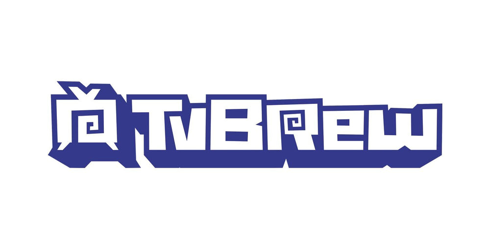

Simi Wines font production
The SIMI Winery “Goodness from Grit” campaign shares the remarkable, untold story of Isabelle Simi, the winery’s most fearless leader.
Role
Whilst collaborating with Venables Bell & Partners, I was tasked with transforming hand-drawn letterforms designed by their in-house team into a fully functional vector typeface.
Project Description
The original design featured numerous intricate, hand-drawn details. My aim was to simplify these details as much as possible while preserving the energy and style of the original artwork.
The font includes several ligatures to ensure it flows naturally and feels more organic. Additionally, alternative letterforms were incorporated into the typeface, enabling designers to create more varied and less repetitive type arrangements.